Strictly out of the box – a bad user experience
I’ve been designing and deploying standardized Windows Desktops in world-wide corporations for many years, and I’ve also presented and discussed the usability aspects of corporate clients with various businesses. What seems to be common is that central IT departments often want to keep the configuration as close to default as possible, apart from security configurations which they love to tweak and tighten – or even if they don’t love to they do so because the security guys tell them to. Nobody questions security, which is more than you can say about usability.
However, the closer you get to the actual users, for example to local IT coordinators, support personnel or the like, the more they want to configure the client for improved usability. I know an horrific example where the Corporate IT department said “usability is out of scope”, “keep it strictly out of the box”, and then the local IT departments went and tweaked the heck out of the client to make the transition to the new client easier for their users. A failure in governance of course. The company ended up with more than 40 different client “designs” globally and needless to say it was a nightmare to manage and maintain up-to-date.
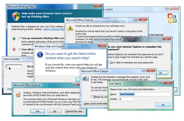
So why and what is it they so desperately want to change from default, you may ask? Well, those who understand the users also understand why you shouldn’t deploy a client that looks like this:
Some time ago I did a usability review of the first beta build of a corporate client based on Vista and Office 2007 which was going to be deployed to 70,000 users, and this was all default and strictly out of the box (apart from the security configurations of course). The first 15 minutes of use I had been prompted about 30 times with questions that normal users don’t understand or simply ignore and just click whatever is default.
Take the lower left prompt in the picture as an example. It asks if the user wants to synchronize RSS Feeds between Outlook, Internet Explorer and whatever else uses something called the Common Feed List. This is Hebrew to most users in large organizations. Most of them don’t even know what an RSS feed is. Hence they will click a random button and not knowing what it means. Some users will have feeds synchronized between Outlook and IE, some won’t. Some will call Helpdesk and ask why behavior is different between their PC and their colleague’s PC next door. And if your Helpdesk is outsourced, it’s likely they will not know the answer because it’s not documented.
Next example – take a look at the lower right prompt in the picture. This is one of the default prompts first time you start a Microsoft Office program. Most users will NOT fill in their name and initials; they will simply hit Enter or click OK. This means all their Microsoft Office documents will be tagged with whatever is default in this field rather than their actual name, which in turn will cause the author META data to be incorrect and result in negative Enterprise Search experience. You have the power, in client design, to ensure all Microsoft Office documents across the enterprise will be tagged with proper user details (and you can even enforce your own model of META data in Microsoft Office “Save dialogue” with SharePoint in the background, see here).
By preconfiguring settings like these (there’s many!) once and for all in the build you’ll avoid confusion and frustration being first impression users get from the new client and you’ll also ensure that the client is configured and behave consistently across the enterprise. In my next article I will describe the approach I normally apply to find out what to configure how for best corporate desktop usability.
.
| Print article | This entry was posted by Richard Nilsson on February 9, 2010 at 13:09, and is filed under All Articles. Follow any responses to this post through RSS 2.0. You can leave a response or trackback from your own site. |

